Introductory
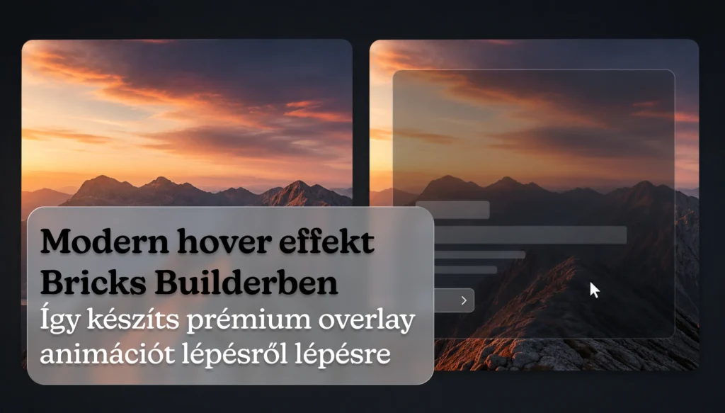
The most eye-catching elements of modern websites are no longer parallax effects or sliders, but subtle micro-animations. One of my favorites is when you hover your mouse over an image and it appears with an overlay of text, a slightly blurred background, and the image subtly zooms in.
This is the detail that instantly makes a website feel more modern and expensive – even though it's not technically complicated.
In this article I will show you how to do this in Bricks Builder step by step. You can also see how it looks live: mirellart.hu On this page you can see hover effects made using exactly this technique.
Video demonstration
What are we going to make?
A hover card where:
- by default only the image is visible
- An overlay with text appears on hover
- the background is slightly blurred (glassmorphism)
- the image zooms gently
- everything is animated smoothly
You can see the live example here: 👉 mirellart.hu
The structure
First, let's build the element structure in Bricks:
Div (parent) ├── Image └── Div (overlay) ├── Heading └── TextTHE parent will be the box that holds it all together. The image will be at the bottom, and the overlay DIV will sit on top of the image with absolute position.
Step 1 – Setting up the parent container
The outermost DIV needs these two settings:
- Position:
relative - Overflow:
hidden
The overflow: hidden is crucial – without it, the blur, animation or zooming image may look out of place and messy.
Step 2 – Positioning the Overlay DIV
The overlay DIV should completely cover the image:
- Position:
absolute - Top / Right / Bottom / Left:
0 - Width / Height:
100%
This will ensure that the overlay sits exactly on top of the image and covers it completely when it appears.
Step 3 – Opacity hover trick
The overlay should be invisible by default and appear on hover.
Default:
opacity: 0;Hover state (in Bricks, :hover in state):
opacity: 1;That's the basic fade-in. It's not premium by itself, but it becomes so with the next steps.
Step 4 – Smooth transition
Most hover effects look cheap because everything happens suddenly. The solution is a simple one. transition:
%root% { transition: all 0.4s ease; }That's it. This will make everything much smoother.
Tip: THE
0.4s – 0.7stransition between gives the most premium feel. Hovering that is too fast gives a cheap look.
Step 5 – Glassmorphism background
Here's where the magic comes in. Add this to the overlay background:
For dark design:
background: rgba(0,0,0,0.45); backdrop-filter: blur(6px);For a bright design:
background: rgba(255,255,255,0.12); backdrop-filter: blur(6px);This gives it that modern, glassy effect you see on premium agency sites.
Step 6 – Image zoom on hover
This detail is what separates a mediocre hover effect from a great one. Add the following to the Image element:
%root% img { transition: transform 0.6s ease; } %root%:hover img { transform: scale(1.06); }This makes the image come slightly closer when hovered. A small movement, but a huge difference.
Why does it work so well?
Because it's not just one animation, but several small details happening at the same time:
- fade-in on overlay
- blur in the background
- zoom in on the image
- smooth transition throughout
This combination gives it that premium feel you see on modern websites. A simple fade-in on its own isn’t modern – it’s the layers that make it so.
I used exactly this solution in mirellart.hu also on the page – it is worth watching live because it says much more than any description.
Mobile optimization
One important thing: no hover on mobile. Therefore:
- or always have the overlay visible on mobile
- or appear on click
- or use a completely different layout on mobile
You can set responsive behavior separately at breakpoints in Bricks.
Summary
A modern hover effect in Bricks Builder is actually not complicated. The secret is:
- good structure (parent + overlay)
- absolute positioning
- opacity animation
- smooth transition
- glass blur background
- fine image zoom
Often it's these small details that take a website to a completely different level - not complicated features.
If you're curious what this all looks like in real life: Check out mirellart.hu
Don't have the time or inclination to mess around with this?
If you want a modern, premium-looking website for yourself or your business – built in Bricks Builder, with attention to such small details – check out mirellart.hu reference, or send a message and we'll discuss what you need.